HIGHLIGHTS
A sneak peek
CONTEXT
LeadMeNot, an accountability app
LeadMeNot is an accountability app designed to help users overcome digital addictions through continuous monitoring and support from an accountability partner.
PROBLEM
Low conversion and poor ratings
Despite its vision, the app struggled with low conversion rates—fewer than 100 paid users out of 20,000 sign-ups—and poor app store ratings, which hindered installs and retention.
SOLUTION
Custom blocker with interventions
To address the lack of real-time support during critical moments, we introduced a highly personalized solution: a custom blocker paired with interventions. This powerful duo helped users manage urges, stay on track, and reduce vulnerabilities to relapse, tackling the core problem behind the poor metrics.
Outcome
87%
Reduction in churn rate
357%
Increase in Active Subscriptions
17%
Boost in App store ratings
$500,000
Pre-Seed Funding secured
Solo designer leading end-to-end design direction
As the Solo Product Designer, I led the end-to-end design direction focused on addressing the challenges of digital addiction and creating tools to empower users to regain control of their digital habits.
Founder, Engineers, Investors
Team
6 Weeks
Timeline
BACKGROUND
When Digital Habits Turn Harmful
Innocent behaviors like scrolling social media, watching pornogrpahy, playing addicting games can spiral into habits that harm relationships, health, and productivity. Over time, they lead to detachment from reality and mental health challenges.
After witnessing the devastating effects of pornography addiction, Jason created LeadMeNot to help users regain control, overcome digital addictions, and rebuild healthier lives.
LeadMeNot initially offered two key features:
Human Partner Support
Users could invite a trusted partner to join their recovery journey. The partner would receive real-time alerts whenever the user encountered triggering content, providing timely support.
Proactive Monitoring
The app actively monitored users' devices to detect triggering content, providing a protective and supportive digital environment.
Together, these features helped LeadMeNot find its initial product market fit by combining proactive monitoring with human accountability, establishing a unique value proposition in the market.
CHALLENGE
Hidden Struggles of a Promising Vision
A promising start
The launch of LeadMeNot was well-received by users. Thanks to good SEO and the product's relevance to user needs, it was organically discovered by a steady stream of new users.
but not sticky enough
Despite the initial success, the majority of users dropped off within the first few months, uncovering a critical issue: poor retention.
Feedback mails
User surveys
App store reviews
Analyzing user feedback revealed a recurring request: the need for a blocker feature.
RESEARCH
Why did users care so much about the blocker?
To uncover the root of the challenges, I conducted user interviews, usability testing, and product surveys.

Step 1
The user encounters a trigger and attempts to access harmful content.

Step 2
A notification is sent to the user, and their partner receives an alert.

Step 3
Overwhelmed by the urge, the user disregards the notification.
Current User Journey: A Storyboard
Insights Uncovered
The research uncovered a nuanced understanding of user behaviors and pain points, offering valuable insights to inform and refine the product.
Delayed support left users vulnerable to relapses
Even with the monitoring and accountability partners, users felt unsupported during critical moments. Delayed partner responses and limited tools left them vulnerable to relapses.
Users usually bypassed restrictions, needing stronger protection
Without accountability partners, users bypassed safeguards by disabling rules or finding workarounds, underscoring the need for a stronger safety net to prevent impulsive actions.
Competitor Analysis
Additionally, competitors offered a "Blocker" feature, highlighting a critical gap in LeadMeNot's offerings. Addressing this gap was essential to achieve feature parity and remain competitive in the market.
SOLUTION
So, how do we create the best blocker out there?
To tackle the challenges, I introduced Blocker, Interventions, and Safe Wall—features that gave users more control, healthier distractions, and stronger safety nets for a scalable, comprehensive solution.
Interventions
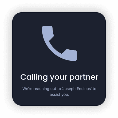
To address the need for support in critical moments, I introduced Interventions, designed to redirect users to healthier alternatives whenever they crossed their boundaries.
Distractions to address delayed support
Users could set up redirections to apps or activities like mindfulness exercises, motivational websites, or calming activities to manage urges in real-time.
Personalized interventions to stay ahead of competitors
Recognizing that personalized distractions are more effective, users could tailor interventions to align with their individual preferences and habits.
Empowering users with minimal reliance
Users could choose interventions that didn’t depend on others, such as calling a friend, viewing motivational quotes rooted in their journey, or seeing inspiring pictures to keep them focused on their goals.

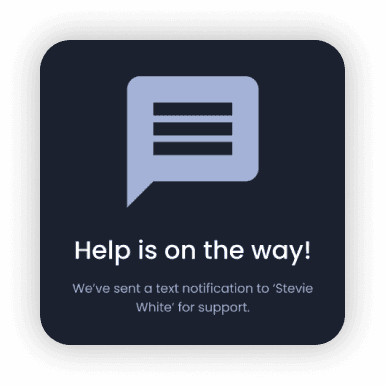
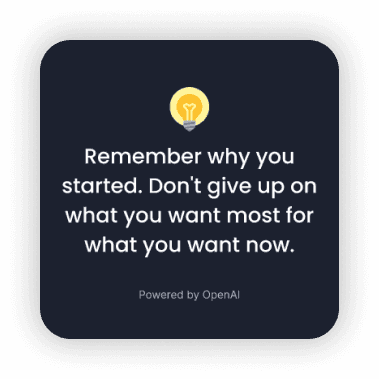
This approach not only helped users stay on track during challenging moments but also encouraged them to quit addictive behaviors by reinforcing positive associations and habits.
Safe Wall
To address the issue of bypassing safeguards, I developed Safe Wall, a multi-layered feature designed to prevent impulsive actions like disabling protections or modifying settings.
Safe Wall offered three levels of protection, allowing users to choose the one that best suited their stage in the recovery journey.
Fortress Mode
Requires users to seek approval from their accountability partner before making changes.
Guarded Mode
Introduces a cooldown period, requiring users to wait for a preselected time before changes take effect.
Self Accountability
Encouraged users to write a sentence of affirmation before making changes, reinforcing their commitment to healthier habits.
This created a robust safety net, helping users stay intentional in their decisions and avoid actions that could derail their long-term goals.
FEEDBACK
From early wins to new challenges
Sustantial improvement
The Blocker feature led to a significant surge in engagement and a noticeable reduction in churn. It was an early win worth celebrating, but…
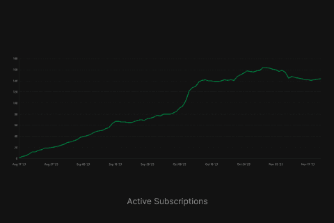
Users got what they asked for but did it solve their core problem?
A one-size-fits-all approach fell short
We launched the Blocker as an experiment with a select group of users and later engaged with them to gather feedback after they had used it for some time and learnt a few things.
Different addictions needed different level of control
While one user might be affected by apps like Instagram, another could struggle with pornography, making a generalized solution ineffective.
Habits are personal and varied
Every user had different habits that sit differently within their lifestyle which made a general solution ineffective.
ITERATIONS
Refining the Solution
Improving the blocker with by providing more personalized control through custom rules.
Custom Rules
To address the challenge of unique user triggers, Custom Rules were introduced, enabling users to block specific habits that were closely tied to their addiction and recovery journey.
Personalized rules
Users could now block specific websites, apps, or keywords tailored to their unique needs.
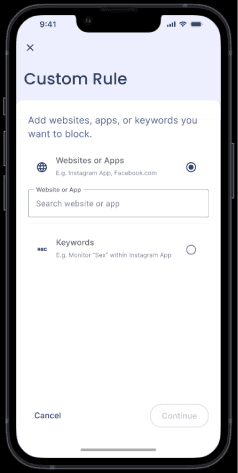
Schedule to break bad habits
Users could set specific timeframes to identify when certain habits were most harmful, helping them establish healthier routines over time.
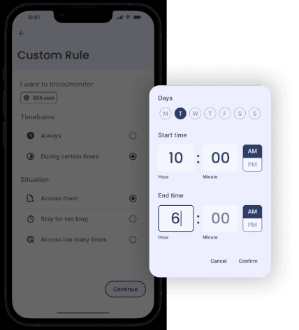
Situation-based rules
Time and session limits allowed users to define boundaries, such as how many times an app could be opened or how long it could be used, supporting gradual habit transformation.
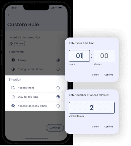
These features gave users greater control over their digital environment & addictions while enabling them to carry out daily activities without the constraints of generic rules.
IMPACT
Numbers say it all
With the new recovery tools in place, the solutions delivered significant business and user outcomes, addressing the core challenges while achieving remarkable success.
Solving for retention had a spillover effect
Addressing retention challenges not only improved user engagement but also positively impacted other areas of the product.
27%
We saw a huge reduction in churn rate
357%
Increase in Active Subscriptions leading to growth in Realized Lifetime Value per Customer (30 days)
App Store Ratings
The impact wasn’t just in the numbers—it was felt deeply by the users themselves. App store ratings improved by 17%, raising the app’s overall rating to 4.3
Eventually improved app store ratings increased app installs and Return on Advertisement Spends (RoAS)
Funds Raised
These features played a pivotal role in helping the founder secure $500,000 in pre-seed funding, supporting the app’s growth and future roadmap.
LEARNINGS
Every journey is a lesson
Working on LeadMeNot offered invaluable insights into balancing design, user behavior, and business goals.
Here are three key lessons I gained from this experience:
Mindful decisions
Designing for sensitive issues like addiction requires care. It requires a lot of understanding of user behavioural patterns.
Small changes matter
Simple features like Safe Wall transformed users’ habits, proving the importance of meaningful, purpose-driven design.
Adapt to achieve
Every project is unique. For LeadMeNot, adapting workflows to meet the needs of the product, users, and business was crucial for driving impact.


